Understanding Color Rendering Index (CRI) & Your Complete Home Lighting Guide
When you think about space flow, ambience, and comfort at home, lighting is a big deal. Brighter light keeps you alert and awake, while softer, warmer light helps you relax and wind down. This practical guide walks you through a simple lighting plan, how to layer light, how to pick the right bulbs, and why you should care about the Color Rendering Index (CRI).
1) Make a Lighting Plan
If you’re starting from scratch or redecorating a room, write a short brief or lighting plan that covers the essentials: what activities happen in each room (eating, relaxing, working)? Which features do you want to highlight? Any architectural constraints that affect placement?
Consider the fixture style, size, output, and color temperature (Kelvin) before you lock in design decisions. Early planning prevents last-minute compromises.

2) Layer Your Lighting
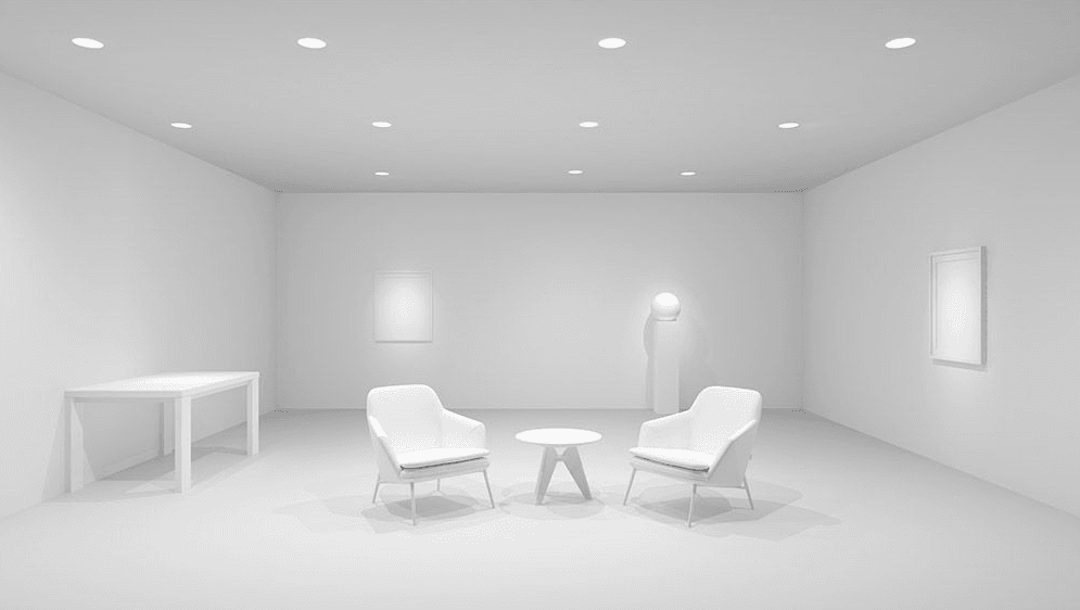
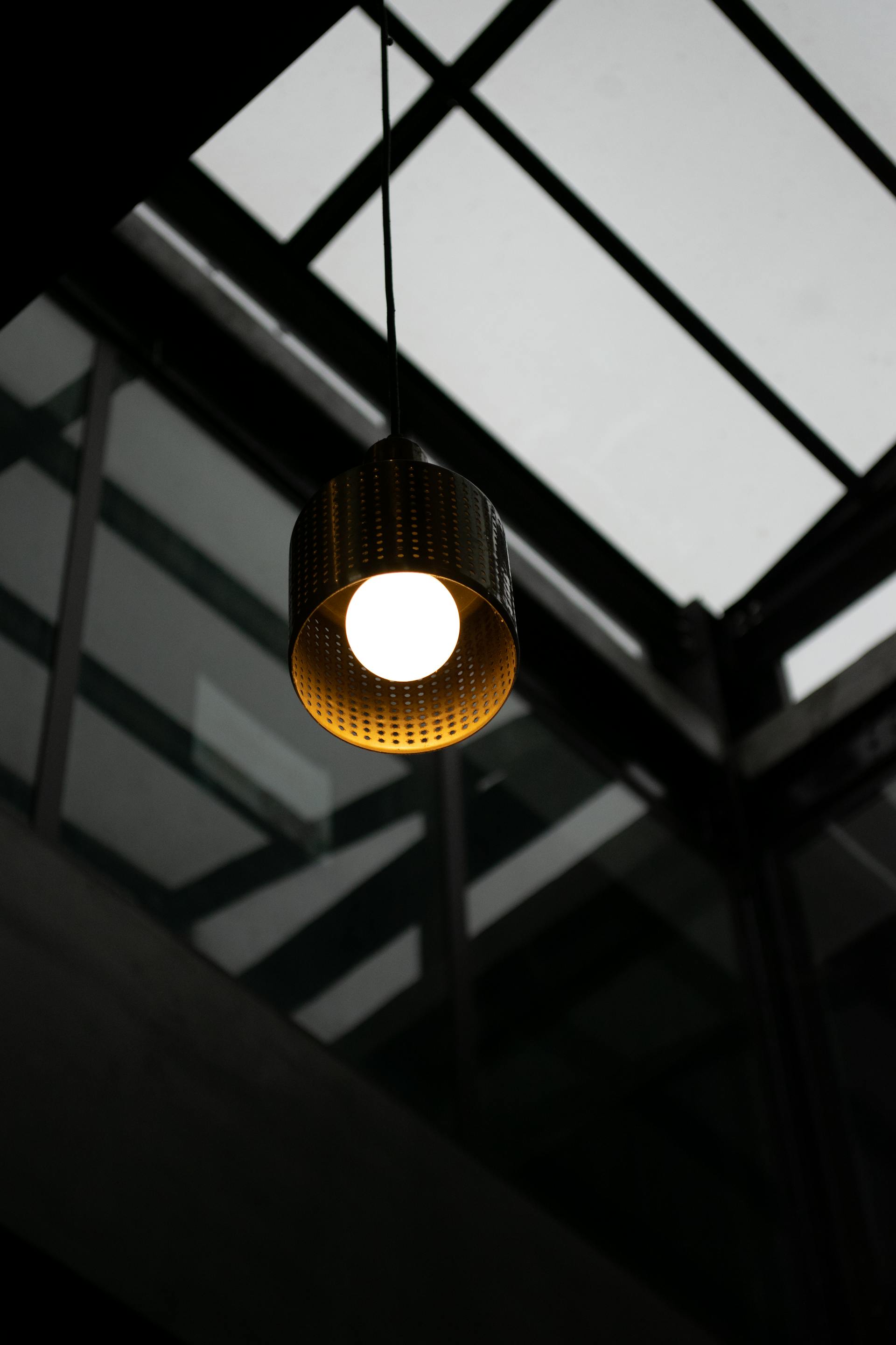
Use a layered approach: combine multiple light sources at different levels to create depth and visual warmth.
- Ambient/General lighting: for balanced overall illumination.
- Task lighting: focused light for desks, countertops, and reading.
- Accent lighting: to highlight artwork, shelves, or architectural details.
Uplighting can make a room feel larger; low-hung pendants can create the illusion of height; and clustered fixtures make large rooms feel cozier.
3) Make Sure the Lighting Is Functional
Match light to the task in each room:
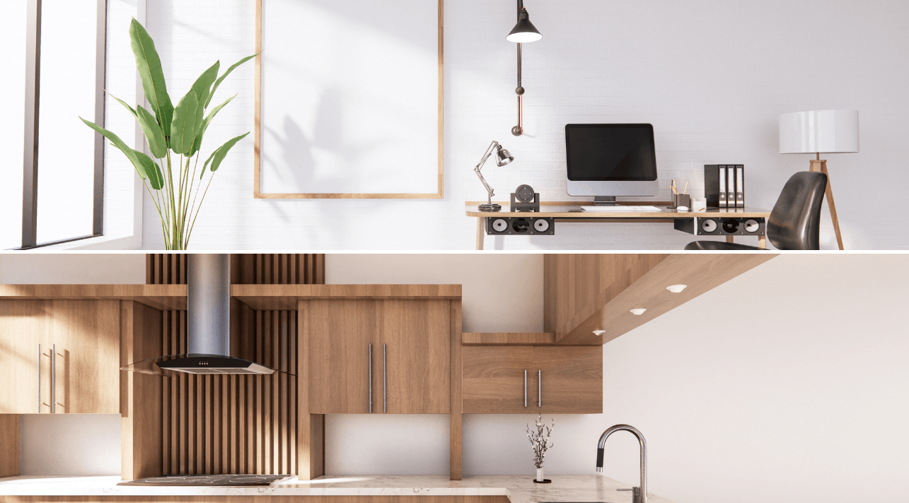
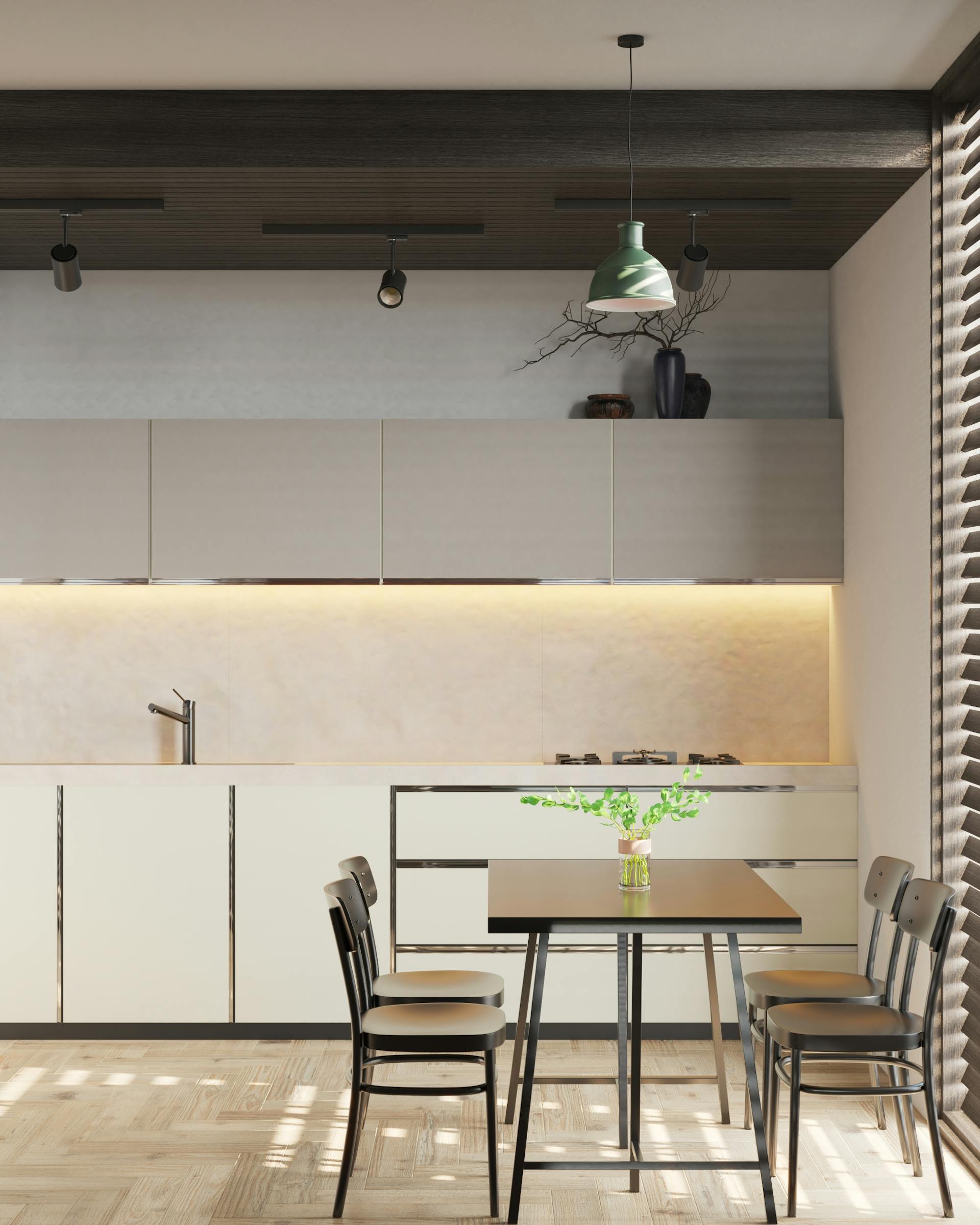
- Kitchen: bright downlights plus under-cabinet lighting and illumination over cooktops.
- Reading & work: go for flexible, directional fixtures.
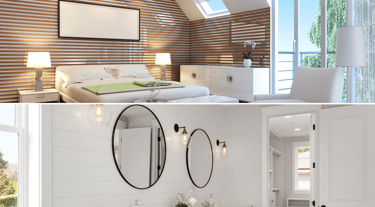
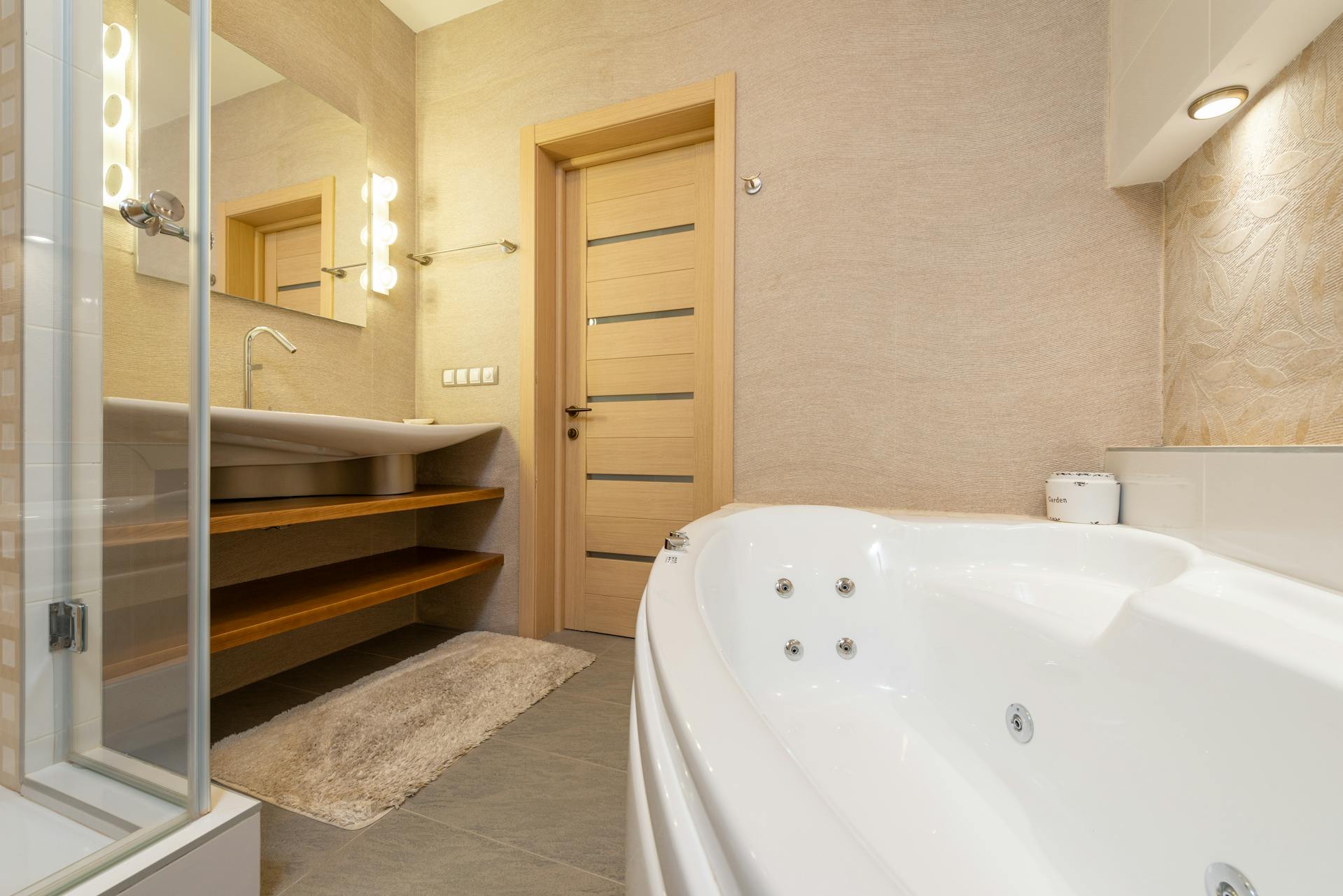
- Bathroom: mix side lights (for mirrors) with overhead downlights.
Dimmers are your best friend for quickly shifting mood and perceived warmth.
4) Choose the Right Bulb
Don’t treat bulbs as an afterthought. Before buying, look at:
- Brightness: measured in lumens (lm). More lumens = more actual light.
- Color temperature: measured in Kelvin (K). Warm 2700–3000K; neutral 3500–4000K; cool 5000K+.
- Efficiency: lumens per watt (lm/W)—vital for lights used many hours a day.
- Color Rendering Index (CRI): the higher it is, the more natural colors look (details below).
- Dimmer compatibility: check for Dimmer Compatible or Dimmable on the package.
5) Use Spotlights to Highlight Favorites
Spotlights amplify key features and support tasks. In kitchens: bright downlights, plus recessed or under-cabinet lighting. For reading: choose adjustable arms and precise aiming. In bathrooms: blend side and overhead light. And remember—dimmers help you shift the vibe in seconds.

6) Make Your Guests Feel Welcome
Dining is always better in a well-lit space—no one wants to eat in the dark. Use spotlights to draw attention to the dining table. Chandeliers and pendants look great above dining areas; just make sure the fixture is centered over the table, whether in a closed room or open plan.
7) Light the Way at Night
Midnight bathroom trips are far easier with soft, low-level lighting. Use floor-level lights in hallways, staircases, and bathrooms to create a gentle guide that won’t blind you when you flip the switch.
8) All About CRI (Color Rendering Index)
CRI is a 0–100 scale that shows how accurately a light source reveals colors compared with a natural reference (daylight/incandescent). The higher the score, the more true-to-life your colors appear.
- CRI ~80: good for most daily use.
- CRI ≥90: great for kitchens, grooming areas, photography corners, and showcasing food/fabrics.
- Pro tip: If R9 (vivid red rendering) is listed, choose a high value for better skin tones and food appearance.
Quick pick guide:
Living rooms & bedrooms: 2700–3000K, CRI ≥ 80–90
Kitchens & bathrooms: 3000–4000K, CRI ≥ 90
Desks & reading nooks: 3000–4000K, CRI ≥ 90, with directional task light + dimmer


